
The Importance Of Media Queries
This tutorial will tell you what media queries are and why they are important.


What Are Media Queries?
Media queries are a feature of CSS that allow you to apply different styles depending on the characteristics of the user's device, such as screen size, resolution, or orientation.
They are commonly used in responsive web design to ensure that websites look good on all devices, from desktops to tablets and smartphones.


Syntax
This is the basic structure of a media query:
@media (condition)
{
/* CSS rules */
}


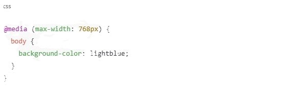
For example, to apply styles only when the screen width is 768 pixels or less (for tablets and mobile devices)